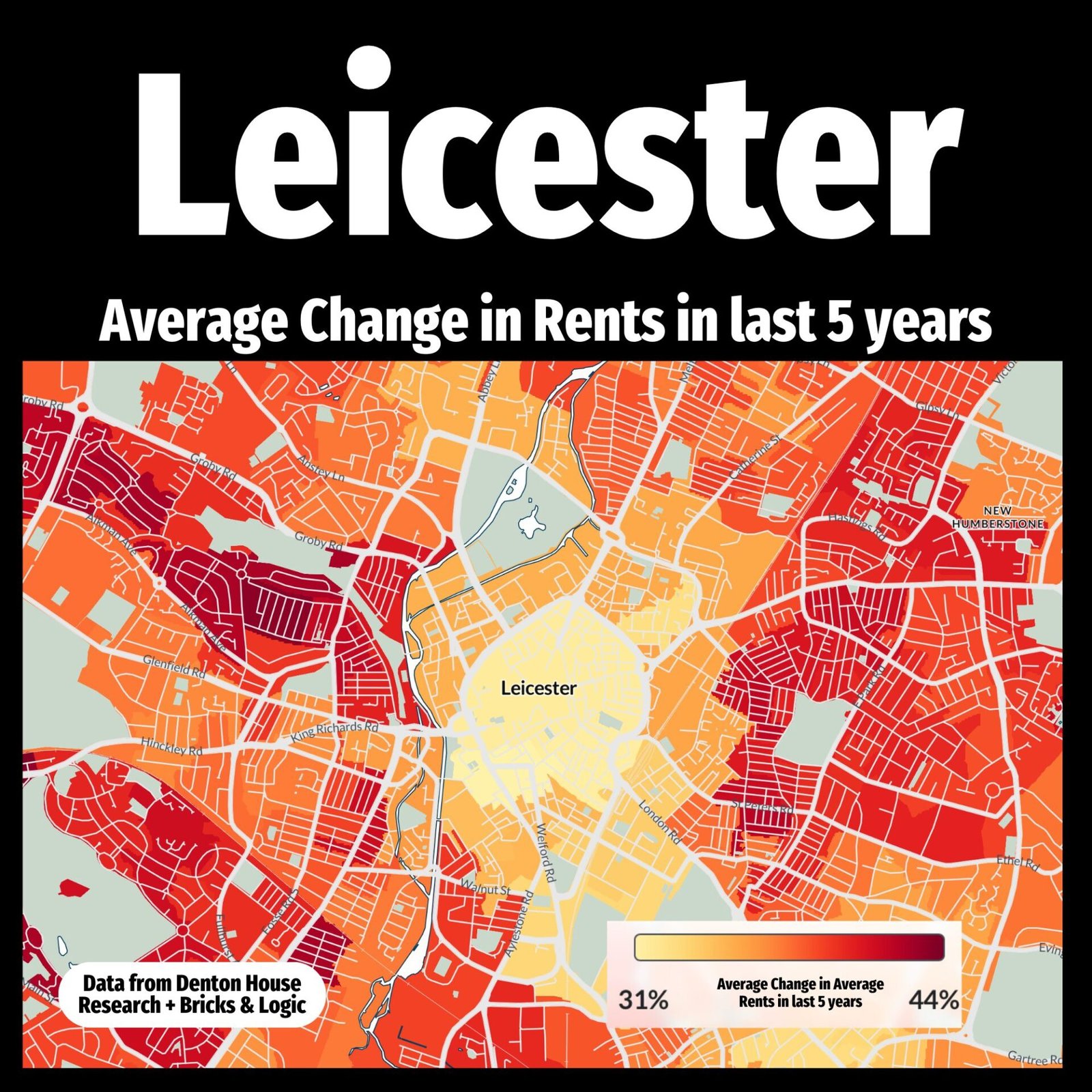
Rents across Leicester have surged in the last five years, but not all parts of the region have grown at the same pace.
This heatmap reveals the average change in rents across Leicester, with darker red areas showing the sharpest increases and lighter yellow zones reflecting more modest rises. While every part of the map shows growth, the degree of that growth varies, telling a powerful story about shifting demand and the changing face of the local rental market.
For Leicester landlords, this offers a window into where returns may be strengthening. For Leicester tenants, it highlights how affordability has been impacted. And for homeowners, especially those considering letting out a property or renting themselves, it’s a reminder that rents don’t stand still.
Whether you’re investing, renting, or just trying to make sense of the market, understanding how Leicester has changed is key to making informed decisions.
Property markets don’t move in straight lines, but they do leave clues. And this map is full of them.
So here’s the question… what do you think is driving such dramatic rental growth across Leicester, and where do you think it’s heading next?